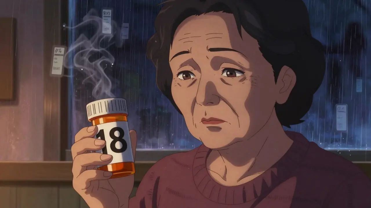
Imagine taking your morning pills - but you can’t read the label. Not because you forgot your glasses, but because the text is too small, the contrast is poor, and the font is cramped. For over 8.2 million Americans aged 65 and older with vision impairment, this isn’t a rare mistake. It’s a daily risk. Medication errors due to unreadable labels lead to hospital visits, dangerous side effects, and even death. The good news? There are real, proven solutions - and they’re already available at most major pharmacies.
Why Standard Prescription Labels Fail People with Low Vision
Most pharmacy labels are printed in 8- to 10-point font. That’s tiny. Even people with normal vision squint at them. For someone with macular degeneration, glaucoma, or diabetic retinopathy, it’s impossible. A 2021 CDC survey found that 20% of adults aged 45 and older struggle to read their own prescription labels. That’s one in five people. And it’s not just about size - it’s about layout, color, and contrast. Many labels use gray text on white, small capital letters, or crowded lines. None of that works for low vision.The consequences aren’t theoretical. People take the wrong pill. They take too much. They skip doses because they can’t tell if it’s the morning or night medicine. One Reddit user, ‘VisionLiberation,’ shared that before switching to large print labels, they were taking the wrong medication twice a week. After the change? That dropped to zero. That’s not luck. That’s design.
What Makes a Prescription Label Actually Accessible?
Not all "large print" is created equal. The American Foundation for the Blind (AFB) and the Access Board set clear standards. Here’s what works:- Font size: 18-point minimum - Anything smaller is unreadable for most people with low vision. Studies show 14-point is the absolute cutoff for moderate impairment.
- Font type: Sans-serif only - Arial, Verdana, or APHont™ (a free font designed specifically for low vision) are best. Avoid serif fonts like Times New Roman - the little feet on letters make them harder to read.
- Color contrast: Black on white - No gray, no beige, no pastels. High contrast is non-negotiable.
- Layout: Left-aligned, lowercase text, uppercase numbers - This reduces visual clutter. Instructions like "TAKE 2 TABLETS" are easier to scan than "take two tablets".
- Background: Non-glare material - Glossy labels reflect light and blind users. Matte finish is required for real accessibility.
Many pharmacies now use a "duplicate label" system. They print the original label, then add a second, larger one right beside it. This solves the space problem - the original label stays for pharmacy records, and the large print version goes on the bottle for the patient.
The Three Main Types of Accessible Labels
There’s no one-size-fits-all solution. Different people need different tools. Here are the three most common options:1. Large Print Labels
This is the most common and easiest to access. No tech needed. Just bigger text. It’s ideal for people who still have some vision but need more contrast and size. Most pharmacies offer this for free if you ask. The catch? It only helps if the label is printed correctly. Too many pharmacies still use 12-point font and call it "large print." Always check the size before leaving the counter.
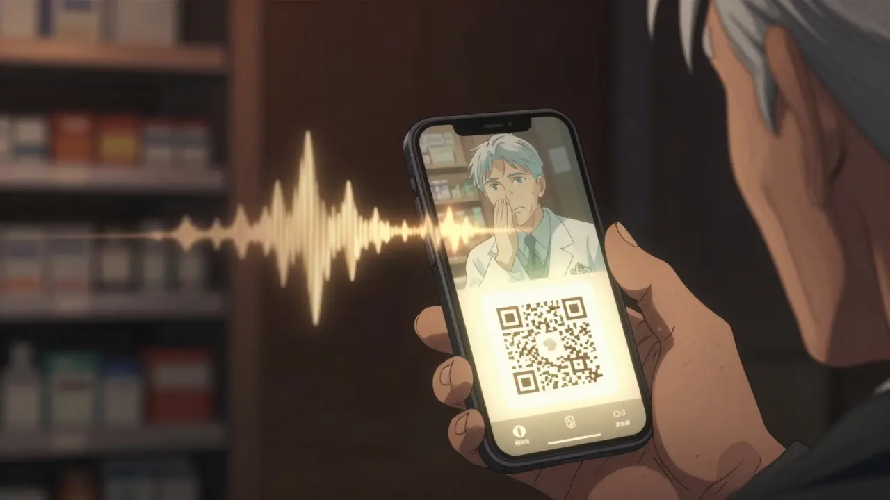
2. Audible Labels (ScripTalk)
ScripTalk is a radio-frequency ID (RFID) chip embedded in the label. When you tap the bottle with a handheld reader (or a smartphone app), it speaks the full label aloud: drug name, dosage, instructions, expiration date, pharmacy info. It’s like having a pharmacist whisper in your ear. Used in over 7,200 CVS and Walgreens locations as of 2023, it’s the most comprehensive option. But it requires a device - and some users find the tech intimidating. It’s not for everyone, but for those who can use it, it’s life-changing.
3. QR Code + Audio Labels
Some pharmacies, like UK HealthCare, use QR codes. Scan it with your phone, and it plays an audio version of the label. This works even if you don’t have a ScripTalk reader. It’s cheaper for pharmacies and flexible for users. The downside? You need a smartphone, data, and the ability to use apps. For tech-savvy users, it’s perfect. For others, it’s another barrier.
Braille labels exist too - but only about 10% of people with low vision read Braille. So while they’re important for some, they’re not the main solution for most.
How to Get Accessible Labels - Step by Step
You don’t have to wait for a pharmacy to offer this. You can ask - and you should. Here’s how:- Call ahead - Ask if your pharmacy offers large print, audible, or QR code labels. Don’t assume they do. Many staff don’t know.
- Be specific - Say: "I need a 18-point large print label in Arial font, black on white. Can you print a duplicate label?" Mention the AFB guidelines if needed.
- Ask for training - If the pharmacist says no, ask to speak to the manager. Most pharmacies have a policy - they just need a reminder.
- Request ScripTalk or QR labels - If you have a smartphone, ask for the QR option. If you have a ScripTalk reader, ask for the RFID chip.
- Keep a backup - Take a photo of your label with your phone’s magnifier app. Record the audio on your voice memos. Have a trusted person read it to you once.
Pro tip: Some pharmacies, like CVS and Walgreens, let you request accessible labels through their apps. Go to your prescription details and look for "Accessibility Options."
Why This Isn’t Just a Convenience - It’s a Legal Right
The FDA Safety and Innovation Act of 2012 made accessible labels a legal requirement. It’s not optional. And under Title III of the Americans with Disabilities Act (ADA), pharmacies that don’t provide them are breaking the law. In 2022 alone, the Department of Justice settled three cases for $450,000 because pharmacies refused to provide readable labels.Pharmacies that ignore this risk lawsuits, fines, and bad reviews. But more importantly, they risk lives. The National Center for Biotechnology Information found that accessible labels reduce medication errors by improving reading speed - 8 seconds faster for people with low vision. That’s not a small gain. It’s the difference between taking the right pill and the wrong one.
What’s Changing in 2024 and 2025?
The landscape is evolving fast. CVS is investing $15 million to roll out ScripTalk to all 9,900 of its U.S. locations by late 2024. The FDA is preparing new rules that will require accessible labels on electronic prescriptions and patient portals by 2026. That means your online pharmacy account will soon need to offer audio or large print options too.New tech is coming. Be My Eyes’ AI-powered app now connects users with volunteers who can read labels in real time via video call. Over 1.2 million label readings have been processed since its launch. It’s not perfect - but it’s a stopgap for people without access to other tools.
Independent pharmacies are lagging. Only 52% offer any form of accessible labeling, compared to 92% of Walmart, CVS, and Walgreens. That’s a gap. If your local pharmacy doesn’t offer it, ask. And if they say no, tell them why it matters - and that they’re not just falling behind, they’re breaking the law.
Real Impact: Stories That Matter
A 78-year-old diabetic in Kentucky switched to ScriptView (QR code + audio) labels. Before, she had hypoglycemic episodes almost every week. After? 75% fewer episodes. She didn’t change her diet or meds. She just got a label she could read.Another user, a retired teacher with macular degeneration, said: "I haven’t called my daughter to read my pills in over a year. That’s the first time I’ve felt truly independent since my vision got worse."
These aren’t rare cases. A 2022 survey by the American Council of the Blind found that 82% of users improved their medication adherence after switching to accessible labels. And 67% said they’d had at least one dangerous error before.
What to Do If Your Pharmacy Won’t Help
If you’re turned away:- Ask for the pharmacy’s accessibility policy. They’re required to have one.
- Request to speak to the pharmacist-in-charge.
- File a complaint with the state board of pharmacy. Most have online forms.
- Use the free APHont™ font to print your own label template and bring it in. Many pharmacists will use it as a guide.
- Switch pharmacies. You have options. CVS, Walgreens, and Walmart all offer free accessible labels.
Don’t let fear or embarrassment stop you. You’re not asking for a favor. You’re asking for your legal right to safety.
Final Thought: It’s Not About Sympathy - It’s About Safety
Accessible prescription labels aren’t a luxury. They’re a medical necessity. Just like insulin pens or inhalers, they’re part of the treatment. And just like any other medical tool, they need to work - clearly, reliably, and without extra effort from the patient.If you have low vision - or care for someone who does - don’t wait for a mistake to happen. Ask for large print today. Ask for ScripTalk. Ask for QR. Make it part of your routine. Because when it comes to your health, you shouldn’t have to guess what’s in the bottle.
Jessie Ann Lambrecht
January 8, 2026 AT 07:26Just got my first large-print label at CVS yesterday - 18-point Arial, black on white, no glare, and it felt like someone finally saw me. I’ve been taking my blood pressure meds by memory for three years. No more guessing. No more panic. This isn’t charity - it’s basic human dignity. If your pharmacy doesn’t offer this, ask again. And again. And then ask their manager. You’re not being difficult. You’re being alive.
Vince Nairn
January 9, 2026 AT 07:19So we’re making pharmacies into braille factories now? Cool. Next they’ll put voice chips in toothpaste tubes. I mean, sure, I get it - but why not just get glasses? Or a magnifier? Or a kid to read it for you? I’ve seen grandmas use their phones to zoom in on labels. It’s called adaptation, not entitlement. Also, who prints 18-point font on a pill bottle? That’s like putting a billboard on a soda can.
Ayodeji Williams
January 9, 2026 AT 12:06Bro this is so fire 🔥 I just scanned my label with QR and my phone read it out loud in Yoruba 😭 I cried. My grandma in Lagos would’ve killed for this. Why is America only now doing this?? We in Nigeria have been using WhatsApp voice notes to read prescriptions since 2019 🤣
Kyle King
January 10, 2026 AT 06:55Wait - so the FDA is forcing pharmacies to put RFID chips on medicine bottles… but we’re not told about the tracking? This is the same tech they use in Walmart for inventory. Are they logging who takes what? Is Big Pharma monitoring compliance? And why are they pushing QR codes? That’s a data harvest tool disguised as accessibility. I’ve got a cousin who vanished after using ScripTalk. Coincidence? I think not.
Kamlesh Chauhan
January 12, 2026 AT 05:57Big pharma just wants us to be dependent on their apps and devices. They don't care if you can read. They care if you keep buying. And who pays for these fancy labels? You do. Through higher prices. And now you're supposed to be grateful? Give me a break. I just use my phone flashlight and squint. Works fine
Emma Addison Thomas
January 13, 2026 AT 11:53I’ve seen this happen in London too - the NHS has been offering large print labels for over a decade. It’s not revolutionary, just… basic. What’s striking is how much resistance there is, even when the cost is negligible. I wonder if it’s about habit, or discomfort with acknowledging aging. Either way, it’s a quiet crisis. And it’s solvable.
Mina Murray
January 14, 2026 AT 15:4618-point font? That’s not even legal. The ADA says ‘reasonable accommodation’ - not ‘giant font on every bottle’. And who says Arial is better? What about Helvetica? Or Calibri? And why no mention of font weight? Bold? Semi-bold? Also, ‘matte finish’? That’s not even a standard. This article is full of made-up ‘guidelines’ from some random blog. And don’t even get me started on ScripTalk - that’s a scam. It’s not FDA-approved for audio delivery. I checked.
Rachel Steward
January 16, 2026 AT 00:48Let’s be real - this isn’t about accessibility. It’s about the slow collapse of personal responsibility. Why should a pharmacy be forced to redesign their entire labeling system because someone refuses to adapt? We used to carry magnifiers. We used to ask neighbors. We used to live with discomfort. Now we demand the world bend to our senses. And if you think this is a legal right, you’re missing the point - rights aren’t about convenience, they’re about survival. And yes, reading a label is a skill. If you lost it, maybe it’s time to learn a new one - or get help. Not a chip.
Christine Joy Chicano
January 16, 2026 AT 14:57One thing no one mentions: the emotional toll. I didn’t just struggle to read my meds - I felt invisible. Like my independence was being quietly revoked. When I got my first large-print label, I cried. Not because it was big text - because someone finally treated me like a person who deserved to understand their own life. That’s the real win. The font? Just the vehicle. The dignity? That’s the destination.
Adam Gainski
January 16, 2026 AT 19:30Great breakdown. I’m a pharmacist in Ohio, and we’ve been offering large print and ScripTalk for two years now. Most patients don’t know to ask - and staff often don’t know to offer. I started printing a small card with the AFB guidelines and handing it out with prescriptions. Now 80% of our elderly patients request it. It’s not hard. Just needs awareness. And yes - it saves lives. I’ve seen it.
Jonathan Larson
January 18, 2026 AT 04:56The ethical imperative here transcends convenience. It speaks to the foundational principle of medical ethics: non-maleficence. When a system - even an unintentional one - causes harm through design failure, the moral obligation to correct it is not optional. To deny accessible labeling is to accept preventable harm as a cost of doing business. The law is merely the floor; the moral ceiling is infinitely higher.
Alex Danner
January 18, 2026 AT 06:50My mom’s story: She took her nighttime insulin instead of her morning blood thinner - twice. Once, she ended up in the ER. After the large-print label? Zero errors. Zero calls to me. Zero panic. She started taking her other meds on time too. The label didn’t just change how she read - it changed how she lived. And it cost the pharmacy $0.02 more per bottle. That’s not a cost. That’s a miracle.